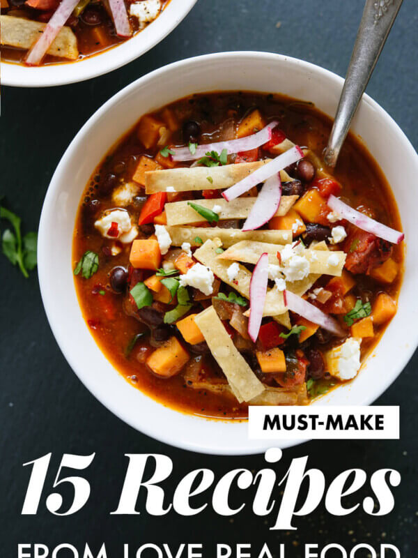
Vote for Love Real Food’s Cover!
Updated by Kathryne Taylor on August 30, 2024
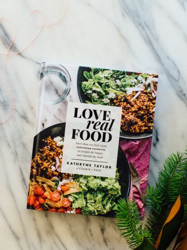
Help! I can’t decide on the cover for my new cookbook, Love Real Food. The book’s designer, Rae Ann, came up with three awesome options. I love them all, and I can’t decide which one should make the cut.
I proposed to my publisher that we let you guys pick the winner and they said yes! You all have been so supportive throughout the cookbook-making progress (thank you) and I’m thrilled that you get to pick the cover.
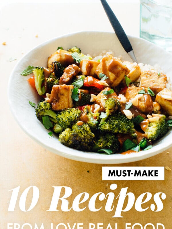
The book is officially available for pre-orders on Amazon and Barnes and Noble. I’m working on some final edits for the book now, and it’s so fun to see it all come together. I can’t wait for you all the see the book on May 16th!
Click through to see all three and vote for your favorite. Voting ends Wednesday, December 14 at noon CST!
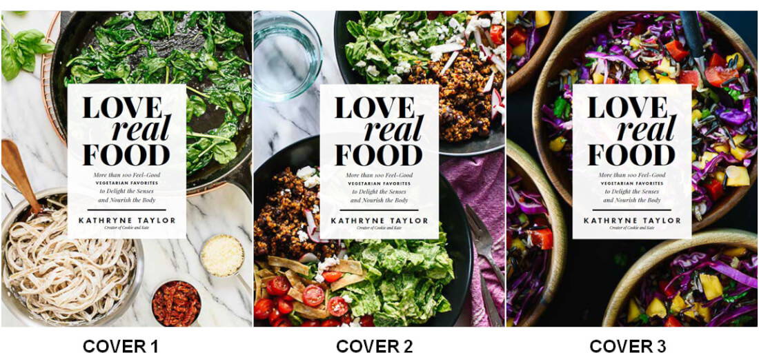
Cover 1
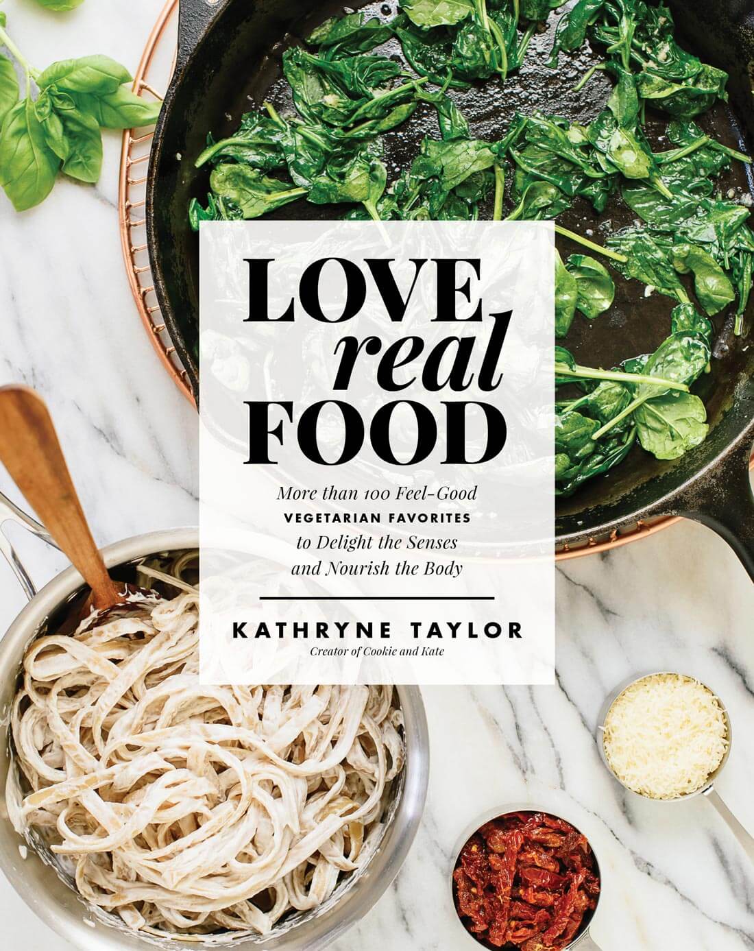
Cover 2
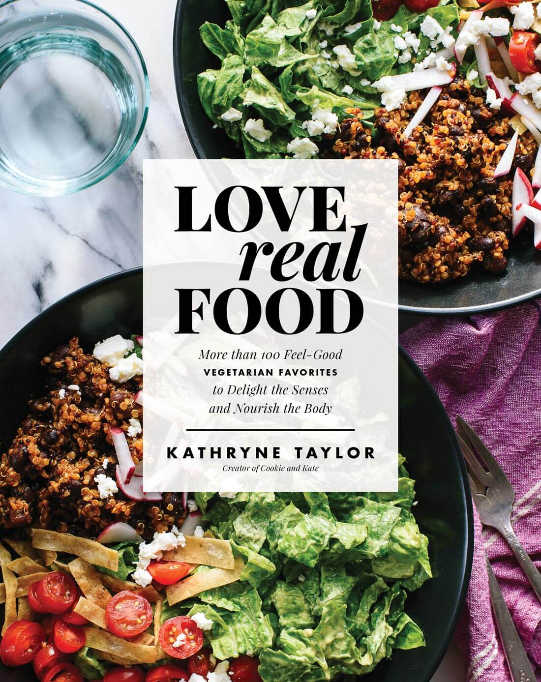
Cover 3
Voting has ended! Thank you all so much for your input.
FINAL RESULTS: 7445 Votes
Cover 1 – 949 Votes (12.8%)
Cover 2 – 3425 Votes (46.1%)
Cover 3 – 3058 Votes (41.1%)
I love cover number two! Thank you so much for your help.


These all look AMAZING! Can’t wait to hold this book in my hands. :)
I think the circle shapes of the bowl make the cover pop more–and there is more color variation with the white noodles. Looking forward to your book!
I like the contrast of the white too and that cover (#1) has a less cluttered feel.
Clean.
Fresh.
Nourishing.
They look great! I voted for cover two because I thought it was more visually interesting by offering more color contrast, especially reds and greens. I also thought the food in cover two looked the most appetizing. Lastly, it seemed very aesthetically balanced – colors, shapes, textures, etc.
I agree, I voted for cover 2 for the same reasons. Great colour and a good variety of ingredients.
Yes, same reasons I picked #2. Up close, the greens in the pan of Cover #1 didn’t look super yummy, but the food in #2 looks awesome. Cover #3 is pretty, but a little too dark for my taste. Cover #2 has great looking food and nice visual contrast with the marble table and the dark pans.
Ditto
I am SO excited for your cookbook! you are hands down my favorite blog to follow & every single recipe I’ve ever made of yours is always amazing & so full of flavor, with no hard to find ingriedients. they’re also easy to make, which as a busy mama to three littles is right up my alley! I will be patiently awaiting May when I can get my hands on your cookbook!
Wrote a super long comment that didn’t post…. But Kristen 100% summed it up. New fan! I’m cooking for an extra picky boyfriend and we’re both trying to eat less meat one day at a time. You make it exponentially easier. Everything we’ve made is a recipe worth keeping for the long run. Thank you, keep up the awesomeness and congrats with the success !
Ps voted for #3
Very excited for this! I love your recipes!
Cover two makes me want to know the recipe for the bowl at the bottom of the cover- it looks appealing.
Easy choice for me, Cover 2 by far the most appealing! 1 is too plain and 3 is too purple. 2 has a nice variety of foods/colors without being too busy.
Really look forward to the book, Kate!
Erik
I didn’t vote because I wasn’t sure what to pick, and thought my qualitative feedback maybe would be better! So first things first, I’m buying your book no matter what :)… But if we get to weigh in on a cover, I agree with another commenter that I think the first one with the noodles is very visually appealing (shapes, color contrasts), but for me it felt like the one LEAST representative of your approach to food (not enough veggies! :)). Cover 2 really feels like a C&K recipe, and Cover 3 I love for the bright saturated purples, reds and yellows (and also feels like a C&K meal).
Jess – you summed it up great! I ultimately chose #2 because I think it is visually appealing but also represents Kate’s approach and recipes the best. Congrats Kate on the book!
Love the colour of the #3 potential cover Kate – it’s appealing, vibrant, alive. If it were on a shelf it would make me want to pick it up to have a look at what’s inside. And then, of course, buy it. Continued success!!
Cover #1 is simple, elegant while still conveying the healthy message. Definitely cover #1.
I agree. This was my choice as well…although it was tough!
Agree! Love the clean feel of the marble counter. I also think the accompanying toppings in tiny bowls is trending and will be appealing to buyers!
They all look great, especially the first one, if I have to choose! I like the bright background tone and the cast iron on it. Looking forward to holding it in my hands! Thank you and good luck Kate!
Congratulations, Kate!! I loved covers 2 and 3, but ultimately decided on #2 for there colors. I liked that #2 was a little more broken up and had some counter space. Can’t wait to see which one wins!
Cover 1, is my favorite though it does kind of edge on the “love and lemons cook book”. It looks the most enticing but may not stand out in the market.
Cover 3, is beautiful as well (the composition of the photography is the strongest) I like the deep rich colors. Interestingly in this example I think you could lower the opacity on the white text container. its too much of a contrast from the photograph. If it was slightly more transparent it would flow seamlessly… just some thoughts to play around with.
Marble distracts; black makes purple pop.
Love the simplicity of #1.
I can completely understand how this may be difficult to choose — all love beautiful! I voted for cover #3 :) Can’t wait to have this cookbook in my kitchen! Your blog is already my go-to…which means your cookbook is easily going to become my little recipe-bible! Cheers!
Love #2 …variety & colorful.
I picked #2. It makes me want to eat that food..
I love cover 1. It lets the title stand out!
Love them all but #1 feels like a cleaner look, which perfectly ties into your clean, simple and healthy recipes.
Hi! All are beautifuI options but I ultimately voted on cover 1 – it is nice having the fresh basil, contrasting the cooked and more prepared ingredients. It also creates a good balance and has more dynamic and different components than 2 & 3. Options 2 and 3 are beautiful photographs of their repective recipes, but give away the whole finished meal. Option 1 matches the title of the book, along with keeping you guessing on recipes on the inside, which make me want to open it. Good luck! Can’t wait to see the final product :)
I can see why you have difficulty choosing the one – I especially liked 1 and 3. But number 3 gets my vote – I love the colors – and I think is the most representative of you – colorful, healthy and pretty!
Choosing a cover was a no-brainer for me (I’m sure it was easier because I don’t have an emotional investment in the book). I really like #2 because of the variety of color and it’s not too busy.
Love the third one – the colors really pop! Congratulations – can’t wait to read it!
Really looking forward to your cookbook! Can’t WAIT! I agree with Erik B.’s comments and voted for Cover 2. It has the most variety of colors and foods. There is repetition of the bean and grain dish in both bowls of that one, however. You might consider replacing the top bowl in Cover 2 with the purple dish in Cover 3. Adds even more color and interest.
#1 was my favorite! Wasn’t quite sure what was in #2 bowl and #3 had too much color! Simple and appealing! Can’t wait for your cookbook!! Love all your recipes.
The third cover is absolutely fantastic! I would buy it purely for the beautiful purple colour! Thank you so much for your wonderful recipes Kate! I check your blog weekly for inspiration, and have made quite a few things so far – enchiladas were on the menu last weekend. Totally delicious! You’re doing a fab job! Lots of love from Ireland!
I am so excited for your new cookbook! I make your recipes almost every week and my family loves them. Thank you for creating such delicious food!
They all look amazing, but without even thinking or realizing what this was at first, my eye was automatically drawn to the third one. The colors are beautiful, deep and just gorgeous! You just know delicious and decadent yumminess will be hiding under that beautiful cover. I’d snatch that book up in a heart beat. Number two has more variety of color which is also great so that would also work, I’d buy that one too! Keep up the amazing work- I love your recipes!
Can’t wait!
Looks the most intriguing to me. Honestly makes me want to tuck in
I WANT TO VOTE FOR ALL THE COVERS lol that was soo hard <3 I am big on color, however, when it came down to it I feel like cover 1 is the most in line with current trends and very visually pleasing as well as modern and expensive looking! Probably the one that would make it on my coffee table :)
Great photos but 3 is too busy 1 is too bland….as they say in the nursery rhymes 2 is just right.
Best of Luck
Number 3 because eating a lot of different colors is an easy way to make healthy vegetable choices.
I voted for 1 because my eye was drawn to it the first, maybe because the marble background balances it out well, I’m not really sure. I think the food in #2 looks great with all the colors but I still like the lighter balance on #1. good luck it will be fun to see how it all works out and I can’t wait to get a book.
3. The black background energizes the color of the food making it look super fresh
Love them all, but the second one catched my eyes because tye colorfullness of the plates
I voted for cover 1 because although I love all of the cover choices, I ultimately feel that cover 1 embodies the core message you send about food – keeping it simple, about real, whole foods. Kind of like back to the basics, to where everything starts. Also, I’m so excited about your cookbook!!! :)
Definitely cover #2! more colors, more variety of veggies – more appealing to those unfamiliar with your recipes. I am buying it anyway! I personally love your step-by-step photos of all recipes – it always catches the eye even more that just seeing the final dish! I haven’t seen similar approach with other food bloggers, and that makes “Cookie&Kate” really stand out. If I could make cover #4 – it would be cover 2 + smaller circles of step-by-step pics of these amazing quinoa bowls recipes. Love your recipes! Good luck Kate!
More colorful and exciting!
I can see why you’re having a hard time deciding! They’re all so beautiful. Can’t wait to see which one wins! :)
p.s. I voted for #2. It’s the perfect balance of color and I feel like the recipe is begging me to look inside and find it! ;)
I cannot wait for this recipe book!!!
#3 really makes an impact and stand out from other cook books making the buyer want to,pick,it up and see what the book is about. Number 1 is so safe and boring, number 2 is ok but number 3 is the bees knees as one would say
Good luck with your book!
They all look really good!! I had a hard time deciding between covers 1 and 2. I feel like they are both really visually appealing and that the food displayed would appeal to a wide audience. I love the clean look of cover 1 but ultimately I picked number 2 because I feel like it best represents your food. Simple and beautiful but also with a variety of ingredients and flavors.
I vote for cover 3, why if I saw it in the store I would definitely pick it up, the colors and simplicity draw you in, cover 2 look too healthy and would scare people away from you if they never followed or cook your food, and cover 1 too boring and that is not who you are. Cannot wait to get my hands busy in the kitchen, every recipes I made of your is always an explosion in my mouth!
Loved 2&3, but 3 is my favorite as it is different and isn’t purple the new green?
They all look so pretty, but #2 is my fav overall. Just voted.
I love your website and I certainly love getting emails with new fun ideas for each month. Can’t wait for the book! Love it
Love cover #1 for its simplicity!
So excited for you!
1- too sparse
2. Balance of food and colors
3 almost went with love the color
I picked 2 ,,,,maybe add some purple to 2