Vote for Love Real Food’s Cover!
Updated by Kathryne Taylor on August 30, 2024
Help! I can’t decide on the cover for my new cookbook, Love Real Food. The book’s designer, Rae Ann, came up with three awesome options. I love them all, and I can’t decide which one should make the cut.
I proposed to my publisher that we let you guys pick the winner and they said yes! You all have been so supportive throughout the cookbook-making progress (thank you) and I’m thrilled that you get to pick the cover.
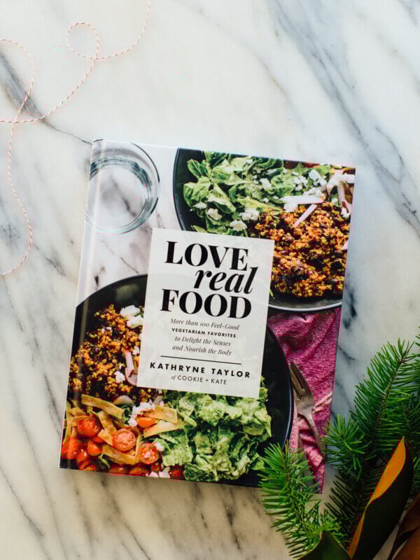
The book is officially available for pre-orders on Amazon and Barnes and Noble. I’m working on some final edits for the book now, and it’s so fun to see it all come together. I can’t wait for you all the see the book on May 16th!
Click through to see all three and vote for your favorite. Voting ends Wednesday, December 14 at noon CST!
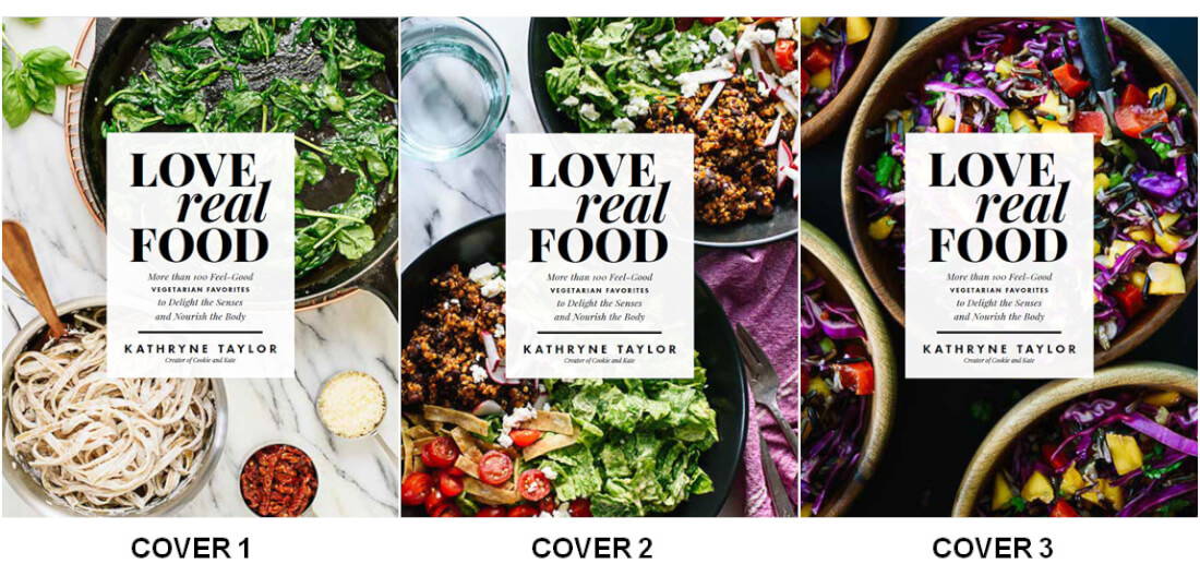
Cover 1
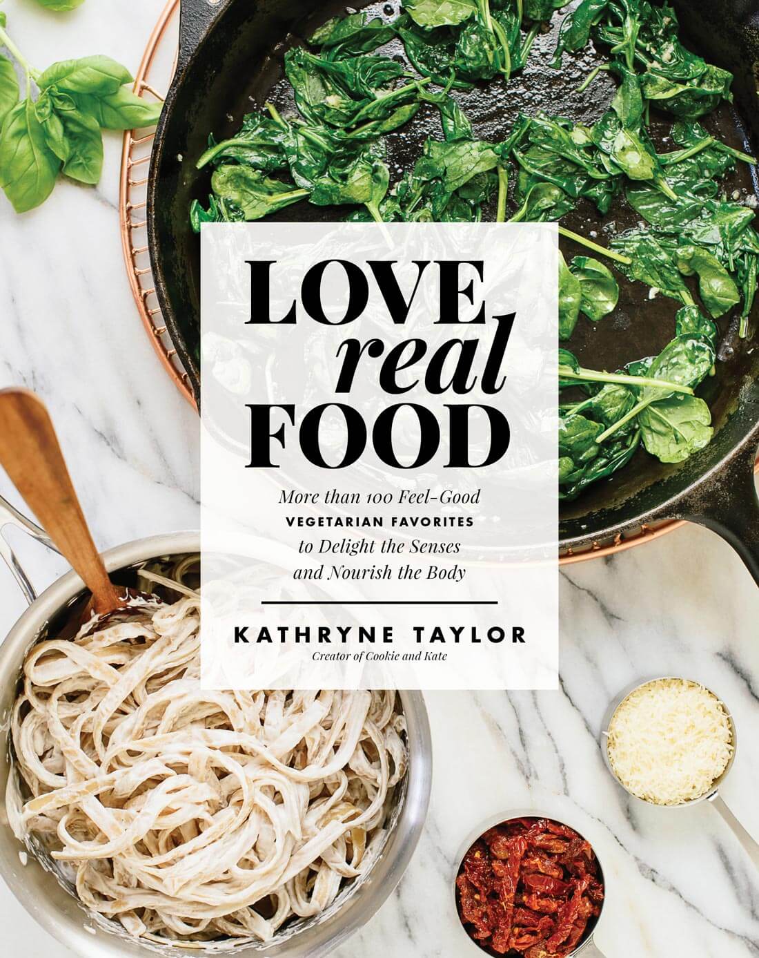
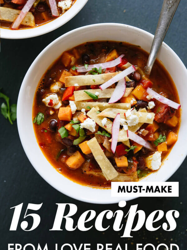
Cover 2
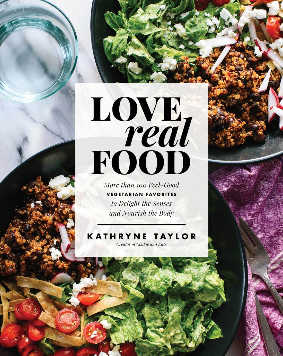
Cover 3
Voting has ended! Thank you all so much for your input.
FINAL RESULTS: 7445 Votes
Cover 1 – 949 Votes (12.8%)
Cover 2 – 3425 Votes (46.1%)
Cover 3 – 3058 Votes (41.1%)
I love cover number two! Thank you so much for your help.


I like cover 3 because of the beautiful colors!
I like cover 2. They all look very appealing but I think the second one would catch my eye if I was browsing through a book store.
No 2 is my favorite. I asked my son as well and he likes that one best as well. Good luck with finalizing the cookbook and am looking forward to it .
I can’t wait for your cookbook! I voted for cover #3 because I found the colors visually appealing. Purple fruits/vegetables don’t seem to be showcased as often and I think this cover really highlights them.
My eyes were drawn to
Cover 3 because I could
‘Feel’ how crunchy and healthy the food pictured would be. Cover 2 was a close second because of the colors; I found cover 1 visually boring.
I was initially going to vote for #3 because of the vibrant colour, but I like the variety of items in cover 2 and, as someone else said, it feels like a Cookie and Kate recipe. Overall I love 2 and 3 for different reasons. Definitely not #1; too sparse.
Hi Kate, I have been enjoying your colorful and healthful recipes. I did
vote for cover #3 for your upcoming cookbook. I want to
mention that I think the title would look better in the lower
right hand side. I think it’s a shame that the title is covering
up such a brilliant salad photo. Just a thought. And good
luck with your cookbook.
Sincerely,
Leona Dressler
Beautifully done!
I think each cover is beautiful and makes me want to cook. The first makes me think the cookbook will have Italian recipes and #2 will have Mexican. I vote for cover #3 because the food looks most representative of your recipes. Thank you for the healthful inspiration!
Dear Kate,
I hope it will be a ebook as I always download my books.
Best wishes with your book.
2 for sure – the noodles in 1 are bland looking and 3 is too repetitive – 2 is beautiful and shows range
Definitely 2 or 3! The colors draw me in more than cover 1. I can’t wait for it to come out! I’ll be pre-ordering it no matter what cover you choose :)
I voted for option #3. It seemed like the hands-down winner to me and my vote counts more than others since I’m a graphic designer (just kidding!!!) Congrats, Kate. I can’t wait to order my copy.
Hi Kate! Congratulations on your upcoming cookbook! I just voted and wanted to leave a message here to let you know that yours was one of the blogs that inspired me to start my own. All your tips and advice have really helped me get started, so thank you! Best of luck with your new book! I can’t wait to grab one!
All Covers look great. My preference however, is no.!. I love the simplicity. The other 2, while colourful , are a little too busy on the eye for me.
1: too white. 3: too purple. 2: just right!
agreed!
I love the vivid colors of number 3.
Go with # 2
Colorful food grabs my eyes!
Really, really hard to choose. I voted for #3, but all three look fantastic!
All 3 covers are very attractive and inviting. I voted for Cover 2 but you can’t go wrong with the other two either!
Katie, this feels like such a special occasion, as being involved in choosing a book cover is certainly not something readers get to do often -at least not that I know of. So exciting! And I’m already curious to see which one “wins”(the reader’s choice award. haha).
Also, as a random and completely irrelevant side-note: Do you know what makes it all extra fun? The fact that we’ll get to see it on May 16th, which happens to be my birthday. Strange. Very strange indeed…
Hugs and pats, as always xx
Ist choice – Cover One has a good Coffee Table appeal.
Cover Two for the recipe and colours ( 2nd choice due to the purple cloth).
Cover 3 – too much going on. I guess I just don’t like purple.
Oh, that’s sounds really exciting that it’s getting to the publication stage. Looks like the effort really made it happen before etch fall of 2016. Well done, congrats and, of course, Merry Christmas to you!
Cover 2 has the better contrast and visual appearance for the cover I’d say. Everybody has their own thought though, so I look forward seeing what the consensus will be :-)
I follow you on Instagram. You and Cookie are a treat! I like Cover #1 because it is simple AND elegant. Looking forward to the Cookbook.
Hi Kate,
I look forward to getting the cookbook! I voted for 3 because the colors were so OUTSTANDING. I think the food pictured in 2 was more diverse but visually I thought 3 had more verve!
Good luck and thanks!
Karen
We need more “I love #1” commenters! I’m predisposed to classic, clean and simple, but I also think this one best embodies the Mediterranean vibe I know and love from this blog. I cannot wait to get my hands on my copy. We are all celebrating with you – so happy for ourselves and so proud of you!!! And Cookie. Because I’m sure Cookie’s taste-testing approval was a critical element in developing the cookbook. ;)
All the covers are beautiful. Thank you for giving us the opportunity to vote-so fun! I chose #3 because it felt the most representative of a Cookie and Kate recipe…colorful, bold flavors and fresh. And, I love the black background. ;)
The purple cabbage does it. Regal colour even royalty might take up cooking. Recipes fit for a king.
They are all beautiful. Cover #2’s layout is tighter than the others and feels more finished and inviting to me. The purple napkin with fork add dimension. The colors are fresh. I wish the bowls had different foods from each other rather than repeating but I still vote for it. Good luck! Looking forward to having it on my shelf.
Cover 2 is the most balanced of the 3.
I love the red tomatoes. This adds just the right “bright” color-draw…
No. 1 is “empty” of ingredients and bland in color.
No. 3 is way too purple for me.
I will wait till it gets officially released to buy.
Want to see some of the interior…
Cover 3 pops out at you. Elegant and has crisp look.
Congratulations on the book!
Angela
Oh my gosh, all so beautiful! Can’t wait to see the book in person! You’re so close! Casting my vote now! :)
I loved cover #2 and cover #3. I thought cover 2 best illustrates the food you prepare for the blog, but cover 3 was so colorful and vibrant, the colors popped off the cover and would definitely catch my eye if I was looking for a new cookbook at the store or online. So I ultimately chose cover #3 because of the stand out colors, and if I was not someone who followed your blog, this would most catch my attention.
It was tough between 1 and 2 but I thought which one might sell the best out of the two and in my opinion it was 2.
2 is so colorful and yummy looking with a variety of ingredients in the pic. It drew my eye right away and made me curious about the recipe.
Congratulations Kate, I can’t WAIT to get a copy. Every recipe I’ve tried of yours has been awesome, you’re my go-to site for new vegetarian ideas. Good luck, and please let me know if I can help promote you in any way.
Cover 3 is my choice. So colorful and eye catching; you eat with your eyes first and this cover caught my eye more than the other 2.
3. I love 1, but lots of books have that sort of cover, so 3 is awesome and more atand out.
They are all so beautiful! I voted for #3 because it was so bold and felt like it would really stand out on the bookshelf/ while browsing cookbooks on Amazon. But beautiful job on all three :)
I am looking forward to your cookbook, Kate. It is now on my Christmas wish list! Dhyan from Boulder
The rainbow food colors look great with the white countertop.
Great color in 3 but oh, the depth in the second – #2 gets my vote!
I really like them all but the 3rd cover is my favourite!
I voted for cover #1. I like the clean feel and the variety of colors in the shot. It makes me want to know more about what other dishes are just out of camera shot and on the pages inside.
I just voted AND pre-ordered. Can’t wait!!!
Goodness! All the covers are gorgeous but I was drawn to #3. It is vibrant, healthy and visually exciting! Kate I love your food. Thanks for providing recipes for such wonderfully delicious meals!
I can’t wait to own your cook book Kate. The recipes I’ve picked up from your blog are my favourite of all time. You are a true talent and inspiration.
Cover 2 has the best mix of colours I think.
Cover 1 is a little too white/beige for me, although I do understand those who are calling it elegant.
They’re all gorgeous!
So excited about your book, Kate! I had a hard time choosing the cover too :) Cannot wait for it to be available in India!